From Old to New – a Redesign of a Dating App Logo
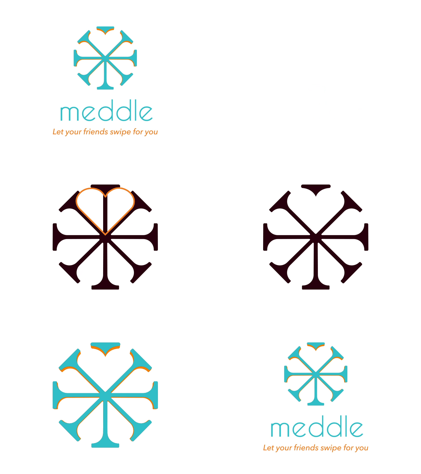
User research showed that the original logo was associated with something corporate rather than a dating app. However, the customer wanted to keep the "Ferris wheel" metaphor. To solve this, I changed the original logo to have rounded corners, added a heart cutout and found a color palette that was aligned to the company values: approachable, trustworthy, and fun.
More by Maria Hagsten Michelsen View profile
Like
