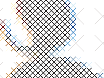
O for UPPERCASE magazine
I was asked to contribute to UPPERCASE magazine’s “Beautiful Bitmaps” project. I chose the letter O and did a study in ClearType as cross-stitch. Really humbled to have work alongside the other people involved. For instance, check out Dominique Falla and Andrei Robu also here on Dribbble.
See all of them here: http://uppercasemagazine.com/beautifulbitmaps
More by Tiffany Wardle View profile
Like
