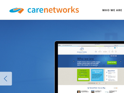
Refined Logo for Homepage
A shot of the future homepage, with a refined logo design for CareNetworks using Source Sans Pro to create a unified and consistent feel throughout the site.
More often than not I find that utilizing one single type family with at least 4-5 weights for a web design project can really prove to be the best solution.
There are obvious file size benefits in saving precious bandwidth on larger projects by limiting the number of webfonts that are being loaded, but it also has great aesthetic value.
More by Tom Lewek View profile
Like
