Metrois
I've been using Windows Mobile alongside IOS for the last few days, and really do like its simplicity. In comparison IOS seems very busy, completely different to Apple's minimalistic design with their site and packaging.
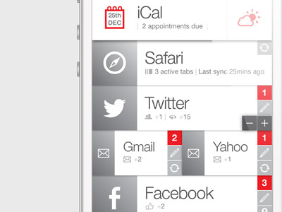
This is literally a quick play around for kicks, based upon 'scaleable' tiles (as Metro) but also the option of showing updates and notifications directly underneath in realtime. Apps also allow users to tweet/compose mails/check in directly from the dashboard.
Holding down a tile allows you to reposition and scale it as Metro will in V8 (indicated with the '- / +').
Top Bar currently shows iCal... swiping left then pulls in Weather... Stocks... again, all customisable. Ideally giving users the options to build their own dashboards with the apps and notifications important to them. Seems a much better logic than a set grid of icons.
OK, this is pretty much a rip of Metro... but do wonder if IOS is due for a re-alignment? Only time will tell... I may finish this off at some point.
