connect
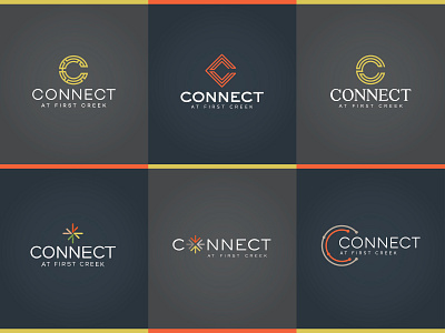
these were for a new apartment complex that is near the light rail train station in denver. i tried a couple logos using arrows to represent movement and also subtly look like snowflakes. the other logos use a "C" as the main design element, two of which have one continuous line making the "C" to represent movement.