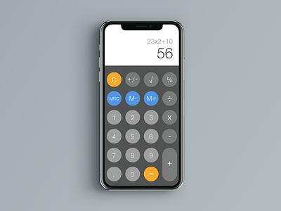
Daily UI 004 - Calculator
Day 4 of the Daily UI challenge. The subject for this challenge was "Calculator." I went back and forth on whether or not I should use square or rounded buttons. I decided to use the round buttons because it felt that it represented the tip of a finger and would entice the user to press it. I know there is much debate on the top of rounded or square buttons, but it felt right in this situation. I also went with a more classic calculator UI that includes memory buttons. Overall, I wanted to keep the design simple, focusing on highlighting the key task for the user, which is calculating a mathematical problem.
More by Jimmy Diep View profile
Like

