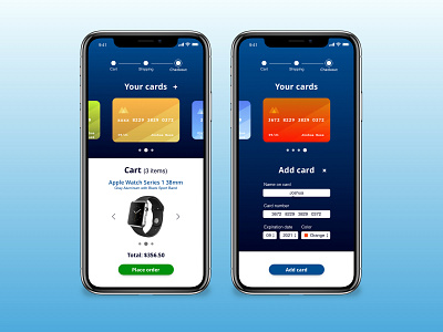
Checkout Page UI | Mobile E-Commerce
This is a shot from 2018, as a part of a daily UI challenge I did for fun and to sharpen my UI skills.
In this concept the user in the third step of the checkout process. The user can still flip through their cart to review it, choose different payment cards as well as add an additional credit card, by pressing the "+" next to "your cards".
As seen in the mockup, the user can also set a colour to the cards, so that they can be easily identified in later purchases.
More by Siggi Baldursson View profile
Like
