Siiimple
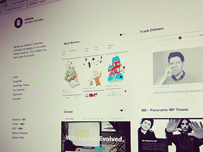
A new re-design of Siiimple.com. http://www.siiimple.com. The previous layout didn't quite reflect the basic, minimalist presentation I really wanted.
So I cut it down, and try to draw subtle lines to divide the content and open up a general sense of spacing. I also wanted the images to be presented fairly large, so it would be easier for the user to get a good sense of what kind of design they were looking at, without having to actually visit the link/page itself - or only if they found the design particular attractive.
The navigation was key, and since I have a registration area, I wanted it to be easy and hassle free.
Hopefully the design as a whole works...
More by Justin Young View profile
Like
