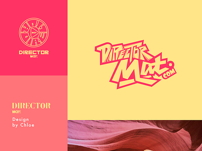
Director Mat Logo
Previously designed a font logo for an American director who works in film and computer programming. On television and new media, he produced a series of documentaries for PBS about poverty alleviation efforts around the world. He won an Emmy for his documentary, and has produced and edited many web series and commercials.
Aesthetically, he enjoys film noir, mechanical devices and graffiti -- a city kid who likes to explore neighborhoods with his feet and inline skates, the nighttime skyline and progressive diverging. As far as color is concerned, he likes black and white or bright colors to express the extremes of color. He is looking for a design that is sharp and modern, and makes a strong first impression.
According to his description, I provided two schemes. One is based on graphics, and the other is designed on fonts. The logo based on graphics is inspired by the play button of video. The logo of font design is designed by Director Mat to highlight Mat.
Hope you like it and feel free to leave comments and feedback. Thank you very much! :)
