Data Table - 2
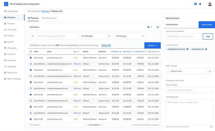
Using our Partner View to test the data table for our Design System. For designers who work on enterprise app, you might not be surprised about a constant user feedback like "I dont want white spaces". But what is the real problem? The research result tells me that it is not about too much white spaces, it is about the size of data they like to see, compare and analyze in one view. However, when the density is high, certain readability maybe lost. In order to find a good balance, I've tried several things here: 1, provide density option on data table that can allow people to view more data on given space. (will upload more screens to compare the diff) 2, remove grid-lines and other unnecessary styles on the table to maximize the visual focus on the data. 3, left align text, right align numbers and use Tabular Lining figures for all numerical data. These will help increase the readability of the data.