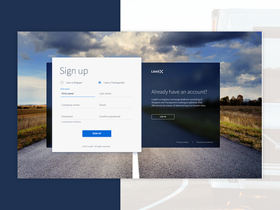
Sign up page
I tried something different for a standard signup form. The idea is that if you selected on the right side there would be a swipe interaction and then the right side would be the white active side.
More by Fiona Botha View profile
Like
