Defiance Digital | Custom Hand Lettering Logotype
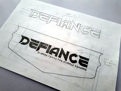
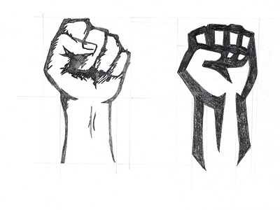
For the Defiance Digital Identity we created a custom font for the logo as we felt that it would benefit the overall design by making it stand out with a unique feel. We also created the custom icons from a sketched fist drawing. The word “Defiance” is bold, powerful and to the point.
By having a custom type and hand-lettered typography it uniquely represents the unique ability the company has in what they do, mixed with a strong icon that shows power.
The type also has a purpose a mixture of shape and curved corners to create balance in visual thinking. Sharpe and curved corners represent different characteristics when they are visually viewed, Sharpe edges appear more aggressive while curved corners are more subtle.
By mixing the two it creates balance with the viewers and alter how people perceive it at first glance, it makes them feel the way they want to feel about the design this creates an emotional connection with your audience.
View the full case study available on our website.
Are you looking for a logo (re)design for your business? I'd be happy to hear your story! Feel free to reach out! ✉ 😀

