Festival Mobile App
A little experiment I did during my time at Beatswitch.
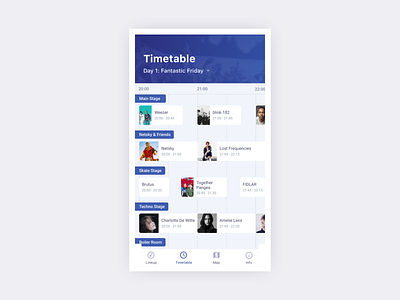
Most mobile timetables are vertically oriented but in this mockup I'm trying to make it work horizontally. The idea is that in this case the content is scrollable, but only the stage names stay visible in the viewport.
What do you think about this?
(Would be nice to see a lineup like that one day! 👯♂️)
More by Jan Van Echelpoel View profile
Like
