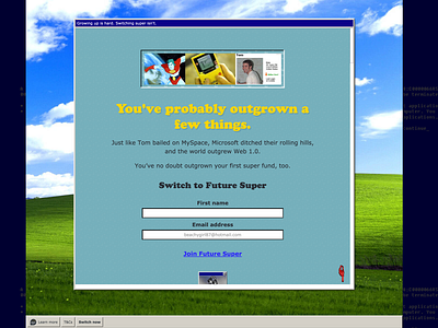
You've probably grown out of a few things...
For this landing page, I recreated the Windows 95 desktop and menu bar.
The idea is to transport the visitor back to a time long gone, where memories might be best left as just that.
Using nostalgia, we're hoping to convey that we've all made some choices we've had to live with, but ditching your old, dodgy super fund is something you can change.
STRATEGY
Target audience’s internal desire to mature / transform / self-actualise and connect it directly to Future Super’s core product offering by invoking the MATURATION PLOT (aka coming of age narrative).
IDEA: Growing Up
Create a positive association between switching super and ‘growing up’ through specific, relatable examples of the things people have outgrown.
Examples of relatable outgrown objects:
— Converse shoes
— Asymmetrical haircut
— Your love of Nu Metal
— NSYNC
— Frosted tip haircuts
Principles
— Show the TRANSFORMATION, don’t tell
— Evoke the notion that growth is NATURAL
— Acknowledge that big changes can be PAINFUL
— Focus on the BENEFITS OF THE NEW, not the tribulations of the old.
