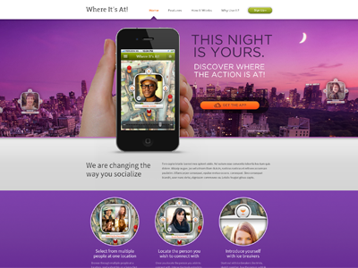
Where It's At! App Website Homepage Revised
View full design shot here: http://goo.gl/H0eGj
Rebound of the Where It's At! App Website homepage I posted a few days ago. Most of these are based on feedback I got. I also used the obligatory "angled on my screen" for the dribble thumb and then I changed the app/phone shots to use the new iPhone5, changed out the hand for a new version, changed some minor other things. Subpage design for this site will be posted in coming days.
Open as always to any other suggestions to improve.
More by Jason Kirtley View profile
Services by Jason Kirtley
Like

