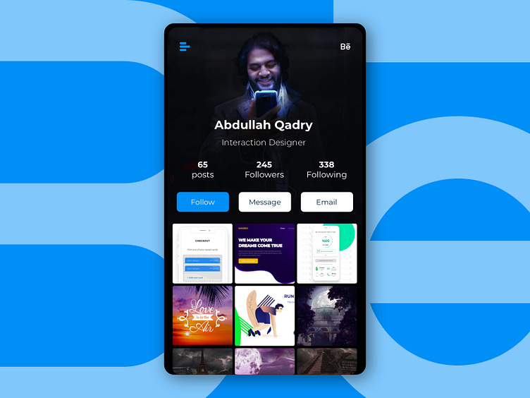
Redesign for profile screen on Behance
So, it's been going around for a while that people started moving away from Behance (Me posting this here is kinda a proof, haha). In my opinion, part of this might be going back to the poor design (on both UI and UX levels) of their mobile app. So for today's UI I decided I did very fast redesign of the profile screen in Behance app. I think since Behance is an artist community, creating optimised profile pictures to fit the theme wouldn't be complicated and it'll be rather nice to have very personalised profile intro. Tell me what do you think and if you think people are really leaving Behance and why? Cheers,,
More by Abdullah Qadry View profile
Like
