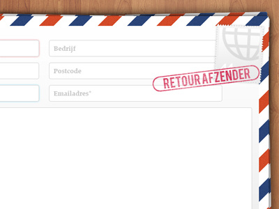
Contact page app website
This is my first shot on Dribbble, thanks goes out to @Basvanderploeg for the invite!
The above image is the contact page for a web and iPad app portal I've designed for our company. Unfortunately, I cannot give you more information about this project just yet, but expect more in the future :)
When the user makes an error in the contact input fields, the "retour afzender" (return to sender) stamp will be placed on top. I didn't want to use any X's or change the input bg to red. What are you thoughts on this? Should I just use the stamp, or do I need some more visual feedback?
Full preview can be seen here: http://cl.ly/ed630afbe3594dbbbabf
More by Dennis Flinsenberg View profile
Like
