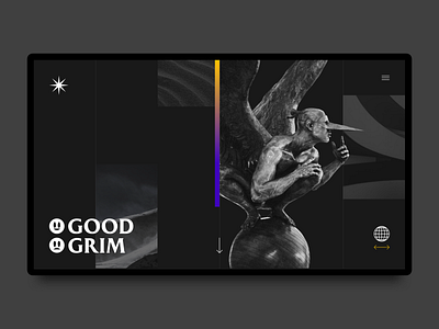
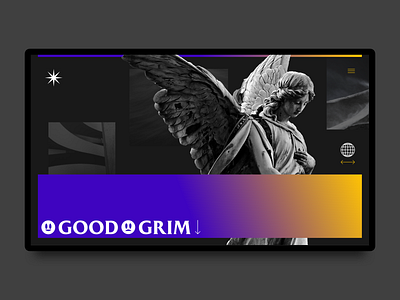
Good & Grim Landing Page - Grim Version
Secondary concept of the good and grim landing page. Focused more on a grayscale composition with a small colour bar to highlight and contrast with the overall composition.
More by Mel Tan View profile
Like

