E
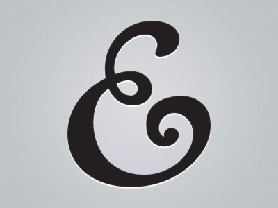
Here's the new E logo with some simple styling in Photoshop. When I feel like I got all the curves in the way I want them, I'll add it to my hot pink wax seal logo to replace the lowercase, sans serif "e" I have there now.
Thoughts? Let me know if the curves look wonky at all to you.
More by Erica Schoonmaker View profile
Like

