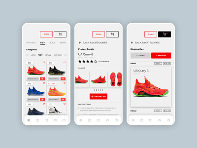
Daily UI #058 - Shopping Cart
Thoughts on Today’s Challenge
Today, I wanted to build out a more meaty experience. I designed three separate screens to display the user flow from a high-level product view to a more focused one.
1st Screen:
This is a higher-level view of the product, currently, we are looking at all the shoe options a customer has to purchase. The page would scroll down infinitely.
2nd Screen:
Here is a view of what the product details page looks like. The image gallery would be a carousel with lightbox images that expand to the width of the screen.
3rd Screen:
Here is the actual shopping cart. I wanted to decrease UI clutter and tried only to include vital components. The main actions to take would be checking out, or changing an item in your cart.
I’m not really into the NBA shoe game, but Steph Curry is my favorite player, so I thought I would showcase some of his shoes for my design. For the record, I am not a bandwagon fan, I grew up here in the Bay and have always been loyal to my teams. Suck it, haters!
Thanks for checking out my shot. 😋👍
-- -- --
The Challenge is to complete one unique User Interface design task every day, for 100 business days. You can read more about it here: https://www.dailyui.co/
Please press L if you like my shot! Also, follow me if you want to keep track of my progress on the Daily Challenges! See you at 100.
