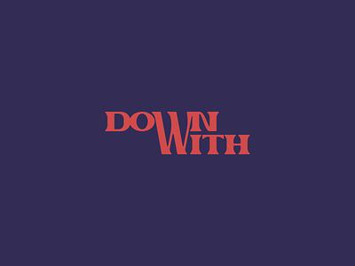
Down With Logo Concepts
Recently worked on a custom logotype for a Chicago based networking company aiming to change the way career entry looks like for people from different ethnic and socioeconomic backgrounds.
The biggest challenge for me with this was trying to solve for having two W's in a small space without it looking redundant.
The client chose the first option (purple background), but you can swipe to see other iterations I presented. I like the chosen option because both words are legible right away, even though only one W was used to bring the words together.
More by Mike™ View profile
Like


