Google Translate redesign
I participated to an online App Redesign challenge organizes by Uplabs and the the app itself was Google Translate. There was no that much constraints, making us choose what we wanted to improve and focus on.
I learned about some design rules and principles and applied them:
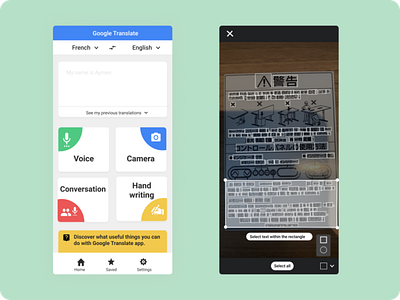
Design composition: I tried to combine icons, colors and shape to create focus on the main buttons: voice, camera, conversations and hand-writing
Proximity: actions that are related should be grouped together for a more coherent structure of the design
Repetition ( shape/colors ) for helping the design have a continuous theme