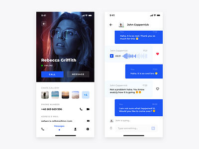
Skype redesign concept- Profile and Chat
Hello again,
Next but not last screens from my Skype redesign concept :). On the profile screen you can see at glance everything that is important: large and visible portrait, option to call or write, pictures from chat history and some basic informations.
As long as chat is the view that user probably will see the most time it is the best possibility to convey some brand colour. Like on the earlier screens main goal was to keep this view very clean and avoid any distractors so user can focus on what is important.
More by Bartek Gadzina View profile
Like


