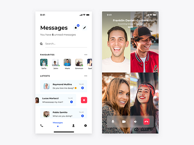
Skype redesign concept- Messages and Video Call
Hello,
Two more screens from my Skype redesign concept. I wanted to make it as simple as possible but still does not want to hurt experience by it. I wanted to convey brand colour in subtle way and I think I got it. In my opinion “Favourites” section would be really useful in Skype, specially for people who has many contacts and keeps in touch with many, many people at one moment so they does not have to search or scroll to find interesting people. Contacts which are displayed are fully editable. User at glance sees how many new messages he has which is also important for busy users.
I also designed new video call screen.
What do you think?
More by Bartek Gadzina View profile
Like


