Daily UI #057 - Video Player
Thoughts on Today’s Challenge
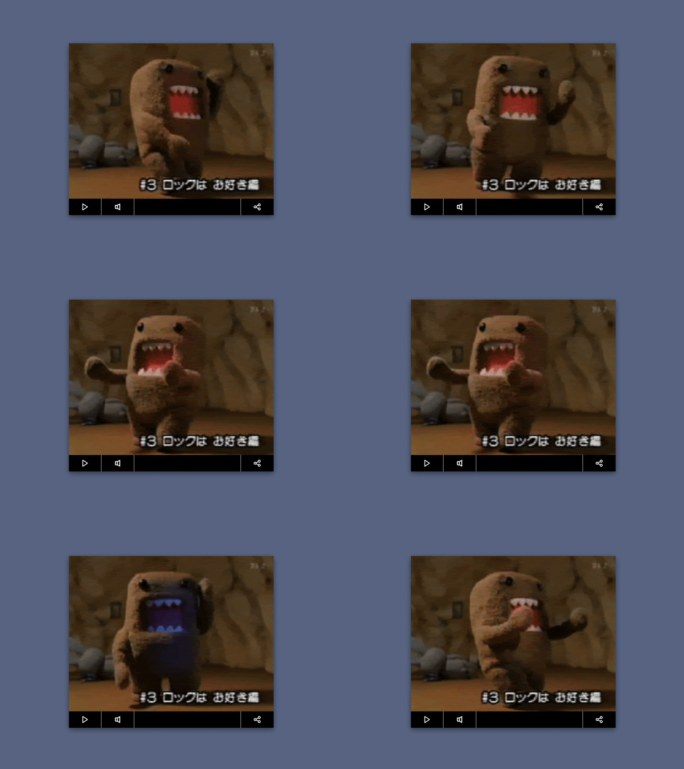
When I got started on the challenge I figured, no need to reinvent the wheel today. I kept the UI very minimal with only 3 buttons: play/pause, volume, and share. The aspect ratio of the video would be web standard 4:3, and the controls would sit under the video.
As for the subject matter of the “video”, I used my favorite Japanese poo monster, Domo Kun.
My first export was way too fast, and Domo looked like he was about to pop out of the video player. I thought it was pretty funny, so I wanted to share that here: https://imgur.com/a/CmhR0rk
Thanks for checking out my shot. 👌👌👌
Enjoy!
-- -- --
The Challenge is to complete one unique User Interface design task every day, for 100 days. You can read more about it here: https://www.dailyui.co/
Please press L if you like my shot! Also, follow me if you want to keep track of my progress on the Daily Challenges! See you at 100.
I am also posting the challenges on Twitter
