App Store Buy Button
Let me preface this by saying I understand that this is one small piece out a very large product, from a very large company. Apple continues to amaze me with the level of quality that they produce.
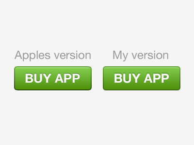
Anyways, I was surfing the new App Store and came across the 'BUY APP' button. First off, I love the initial design. When your looking at a single app page, this button really stands out, and in the best way. It feels soft, and unobtrusive, but still creates a desire in the user to press it.
Second, I think that a few of the details could have been better designed. The inner shadow used for the text (although technically correct) feels a bit sharp, and there is also a single pixel -90º green drop shadow above that as well, causing it to look like an artifact. Also the bottom portion of the outter stroke is a bit too dark in my opinion, and creates a weird weightiness at the bottom of the button.
So, with that, I first lightened that bottom portion of that outter stroke, which made the button feel more balanced, and second I used a 2px -90º drop shadow (size 1px) for the text. As a result the button and text as a whole feel much more balanced.
As you can see, it's the details I'm interested in. I love design, and I am really blessed to do this as my job.
If you have any thoughts on my thoughts, please post em :) Thanks for listening.