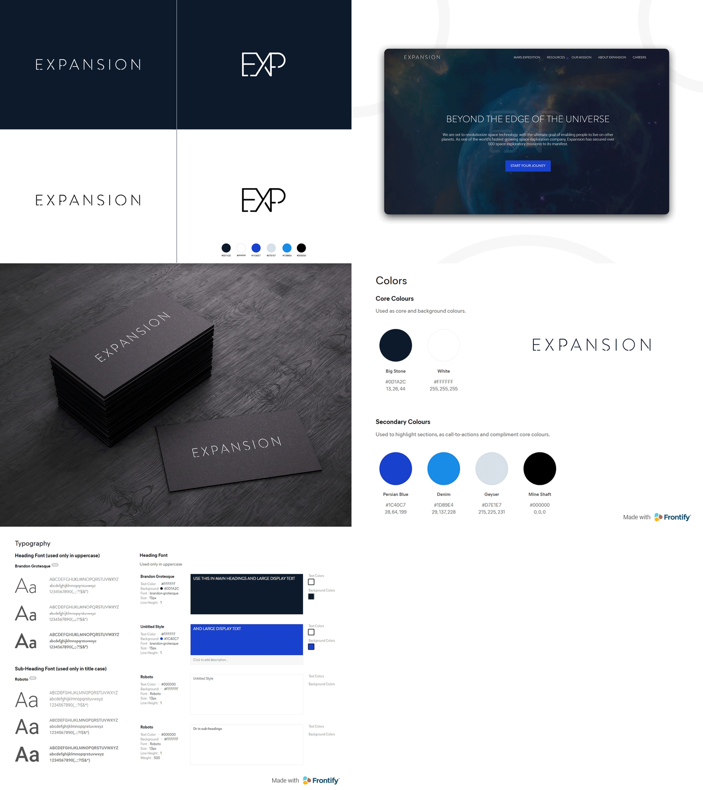
Expansion Brand - Beyond The Universe
When I saw Frontify's contest in partnership with Dribbble, I thought 'now's the time to post my first shot'. After an interesting journey of tweets and emails to getting my first 'invite' to publish shots on the dribble, here are the results:
Introducing Expansion, a faux evolving brand for an evolving world.
Expansion is set to revolutionise space technology with the ultimate goal of enabling people to live on other planets. If this sounds familiar to you, then you might've come across SpaceX :)
It focuses on a clean, sophisticated look with the use of light fonts and a mixture of dark bold colours.
I’ve used @Frontify to collate the brand guidelines. It’s my first time using it and I strongly recommend it to businesses who are looking to ensure brand consistency throughout the team. All digital assets are centralised in a single, intuitive portal making it easy for everyone to access.
You can view the brand guidelines on @Frontify:
https://company-172097.frontify.com/d/r9CswnFRc9dg
Although I do not have a Pro account to post several images and include assets, as a first shot, I hope this will give you a clear view of the brand.
A little bit about me: I’m a digital marketing executive for Netacea (www.netacea.com), with a passion for digital and design. My motto is that without design, marketing would be lifeless and without marketing, design would be mute.

