Apothecary Branding Identity
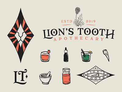
Some unused branding for Lion's Tooth Apothecary. Did a logo option that played around with the shape of a diamond to give it a vintage look. I did not draw the dandelion, but it was a requirement for the logo refresh. In the end we went with a different direction for the branding, but we might revisit some of these assets for future collateral!
More by Chelsea Burkett View profile
Like

