Case study: Cultsport

Hello folks,
Today's case study is on Cultgear, one of the verticals of curefit.
(Please note: The case study is totally based on my opinion.)
Their home page has a clear headline and tagline that lets you know what the product is right away. With minimal use of color, generous line spacing, and a well chosen combination of typography, this website gets everything right.
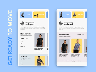
The case study will be on clear product organisation for a seamless shopping experience.
Creating categories on the "New Arrival " section for better product search and to make it instantantly visible.
New Arrival section a. Men Tees Trackpants Shorts See all
b. Women Tee Shorts Bag See all
I have also shared a new design layout.
Some ideas work out, some don’t. It’s only through a certain amount of trial and error, that you end up with a great design. This is why it’s so important to always, always prototype and user test multiple designs.