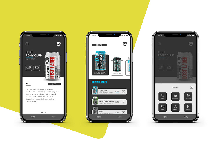
Brewdog app concept
Hello everyone!
Smartphone screens are getting bigger and bigger, making it harder for users to interact with top parts of the screen by using only one hand.
The purpose of this concept was to play around with the idea of moving the menu to the navigation bar. My main question was, if we need to start adapting user journeys and interactions to smartphone development or can we keep implementing same practices? Would love to hear your thoughts.
Hope you like it!
PS.: I really like Brewdog, thats why I used them for this example.
More by Tine Tomazic View profile
Like
