Logocore challenge day 3 | TripleWP
TripleWP is an application for WordPress, that makes the web building experience on WordPress be easier and faster for three times.
The design needed to be friendly, not intimidating.
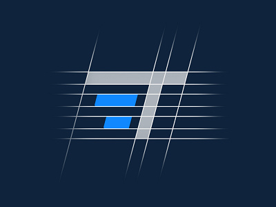
I made the design using their initial letter which is the T, with two horizontal lines under it in the left side which makes it look like number 3, which means triple, combining these lines with an angle to the whole mark give it a sense of speed, which this brand stands for ( making your work x3 faster). The smooth corners on the left side of the horizontal lines makes it look friendly.
More by Hamdi View profile
Like
