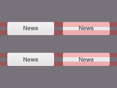
Question about vertical alignment
What is the proper way to vertically align a text with an ascender (and no descenders) in a button like this? The top buttons are aligned on their x-height (metrical correct). The bottom ones are aligned on the cap height (optical correct).
More by Roy Abbink View profile
Like
