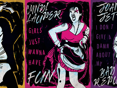
80’s Women Punk Rock
For these design, I wanted to create 3 posters to commemorate early 80s women’s punk rock. The three artists I used in my posters are: Pat Benatar, Cyndi Lauper, and Joan Jett. Even though the women’s movement started in the 60’s and 70’s, and punk sometime before, the women of the 80’s still found it difficult to stand and be seen as credible in male dominated music. Especially in punk rock. The struggle is still very visible, and I wanted to pay homage to three of the many women who decided to push past the expectations that society had for them and prove to themselves and the world that women could be badass musicians, not just their muses. Of my Comps, I really liked all three final ideas I had, but decided to go with the women as focus to commemorate them in a way.
I started out in Procreate and finished these in photoshop. I really loved adding filters and textures to help illustrate a punk aesthetic for these designs. The style of my poster is meant to emulate a fanzine cover. A lot of the research Idid found the zines to be very handmade and textural. I loved it! I attempted a handmade cutout, unfortunately, that would have probably killed me though it would have been killer! I decided instead on a digital grunge using layers of photo and digital textures to get my desired effect. I used one color to define each artist and to help highlight that fun texture, as well as black and white to emphasize the imagery. I wanted to use large rub off type similar to what would have been used at the time but couldn’t find anything that fit with the mood I was going for at our local art stores. We have so many fonts out there, so I decided to download two that were free for personal use: Punk Rock Show which is a sans serif font that has a worn out appearance and Banshee which is a handwritten style font with what appears to be a dry marker or paintbrush.
I definitely knew that punk rock was a huge DIY culture that is crude, informal, raw and very empowering. Art doesn’t have to go through a filtering process to be accepted or to have a message in this medium and it doesn’t have to be pretty and perfectly even to be balanced. It can be a visual riot, a reaction. I feel like my posters really do translate the raw energy of punk rock and make the songs fun and edgy.
The musicians, not the muses
