DailyUI #002: eCommerce Checkout Page
DailyUI #002 : Checkout Page
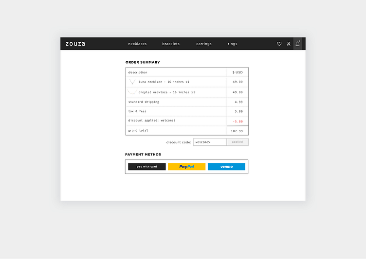
Today's objective was to create a payment form, but since I've recently uploaded a payment form, I wanted to focus on the checkout page. I've been using these challenges as a way to experiment with interfaces for industries that I have less practice with. In this case, I mocked up a quick jewelry e-commerce website to showcase the checkout page.
For this page, I experimented with typefaces. I chose a slab serif font for the item listings because it mimics the look of a traditional receipt, which adds a layer of familiarity and comfort. The vertical itemized layout also makes it easy to scan and make sense of the grand total.
100-Day UI challenge: www.dailyui.co/
More by Grace G. View profile
Like
