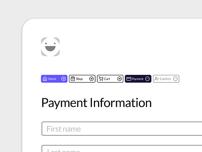
Daily UI #056 - Breadcrumbs
Thoughts on Today’s Challenge
I have designed breadcrumbs in the past, so I am very familiar with their application and functionality. I also used https://semantic-ui.com/collections/breadcrumb.html to round out my points of reference. I used this combination of knowledge to make a solid UI component that is functional, user-friendly, and aesthetically pleasing.
This version of breadcrumbs would act as a progress indicator and serve as page navigation. In this example, the current page is represented by the component with the highest contrast. The lower contrast components are incomplete and would act as disabled buttons. However, this logic would only apply to pages where progress is relevant, such as payment information.
The Home button remains unique to serve as a visual point of reference, it is the only static component in the breadcrumbs. The other component will fluidly change based on the user's place in the website architecture. The next step would be to animate what these interactions would look like, a task for another day.
Thanks for checking out my post, have a great weekend!
-- -- --
The Challenge is to complete one unique User Interface design task every day, for 100 business days. You can read more about it here: https://www.dailyui.co/
Please press L if you like my shot! Also, follow me if you want to keep track of my progress on the Daily Challenges!
I am also posting the challenges on Twitter.
See you at 100. 😋👍
