Payment Splitting app
Hey Dribbblers!
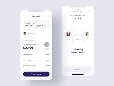
One more shot from the payment splitting app concept today! These views demonstrate the perspective of one the participants after a split request is generated and sent.
The request pops up on the participant’s screen immediately as the app is opened, so it can’t be overlooked. The user can peek the bill, review received request thoroughly and choose to either accept or ignore it.
We're available for new projects! Drop us a line at ux@netguru.com.
—
Show us love! Press "L".
Want to see more projects? Visit our profile or Netguru.com and remember to follow us!
More by Netguru View profile
Like

