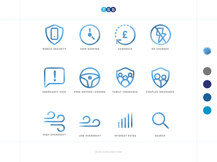
Water colour icons
These exploratory icons were created in an attempt to find a style that worked in harmony with a heavily illustrated brand.
We felt they have a certain charm to them but suffered from accessibility issues so didn't make the final cut.
What do you guys think about masked iconography? delightful and charming or the ultimate sin?
More by Peter Abbott View profile
Like
