known.creative 2018 Brand Exploration
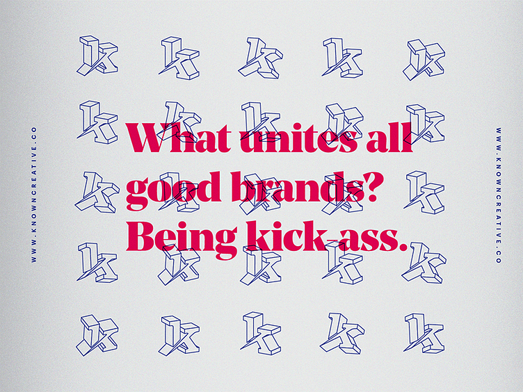


Late last year, I was doing some brand exploration for my former agency, known.creative. Agencies I was researching were doing really interesting UI interactions on their websites, which ultimately inspired me to make these style tiles. With a brand that had a black/white palette for so long, I wanted to see the agency with an extremely vibrant, daring palette. What I ended up with was something I felt was clean and dynamic, but still somewhat Dada-inspired in its energy.
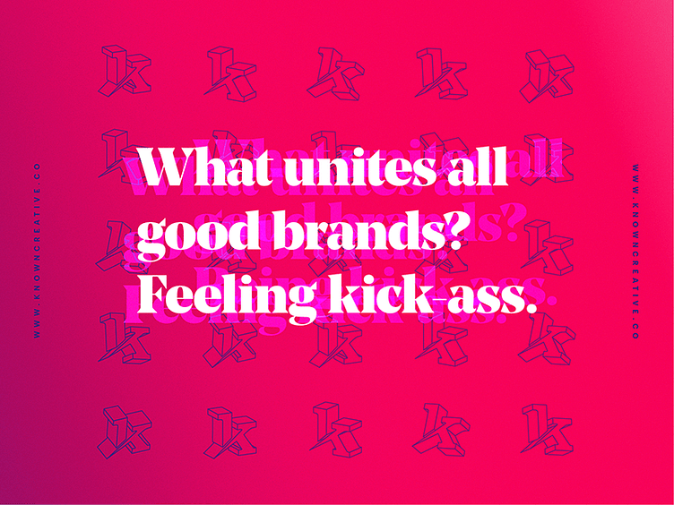
Late last year, I was doing some brand exploration for my former agency, known.creative. Agencies I was researching were doing really interesting UI interactions on their websites, which ultimately inspired me to make these style tiles. With a brand that had a black/white palette for so long, I wanted to see the agency with an extremely vibrant, daring palette. What I ended up with was something I felt was clean and dynamic, but still somewhat Dada-inspired in its energy.
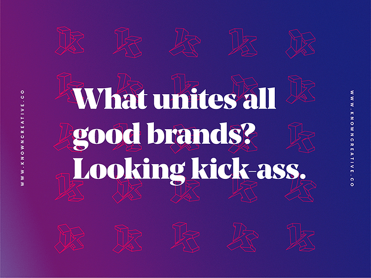
Late last year, I was doing some brand exploration for my former agency, known.creative. Agencies I was researching were doing really interesting UI interactions on their websites, which ultimately inspired me to make these style tiles. With a brand that had a black/white palette for so long, I wanted to see the agency with an extremely vibrant, daring palette. What I ended up with was something I felt was clean and dynamic, but still somewhat Dada-inspired in its energy.