UI Color Study: Visual Design and Color Palette for Warby Parker
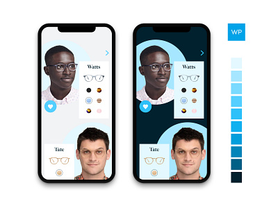
Took a design from the previous post a step further; developed a color palette based on the Warby Parker logo blue (top right). I used the palette to create light and dark UI iterations (shown). Used Gabriel Adorf's Palette app (highly recommend) to get the color palette just right. Really jazzed with the colors; I will continue to use his tool and insights, particularly the idea that as colors get darker, they get more saturated and their value decreases.
Check out Gabriel's Palette App here:
https://www.gabrieladorf.com/palettteapp/
Thanks for stopping by.
