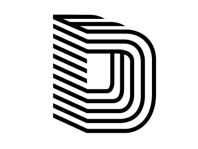
'D' Logotype Sketch No. 2
This is another sketch for an identity system for a gallery that is repositioning themselves. I initially set out to make something graphically witty and smart, but I fear it could look a bit dated. To counteract that, I can see this animating, using a variety of colors or maybe another solution.
All things aside, this might be one of the strongest marks I've made.
More by Tim Collins View profile
Like
