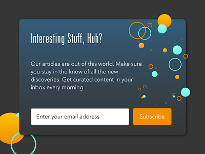
Subscribe Pop-Up
I thought about this pop-up message similar to the error message (flash message) designed previously. The pop up needs a real purpose. Don't interrupt the user to say that the thing worked - I expect that it did work and shouldn't have to click a button to acknowledge that. That message can happen elsewhere (at the bottom or top of a screen - out of the way of the user).
Pop-ups, in general, are annoying, so at least try to make them useful for the business and most importantly for the user.
More by Jordan Nguyen View profile
Like
