Logo Evolution
Hi folks,
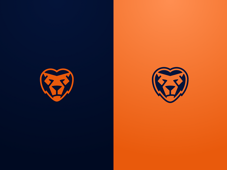
you know it yourself: Logo design is an evolving process and you are never finished. After the last adjustments I decided to create the counterpart to the inverted version. After all, the logo has only worked on dark backgrounds so far.
With discreetly rounded corners I let this version rest and see how it works in different layouts. I also defined the colors a bit more strongly, so the contrast is now crisp and conspicuous. Feedback is welcome as always!
Cheers, Mitch
More by Mitch Loewenherz View profile
Like
