Fairmont Hot Springs Resort Logo
The Fairmont Hot Springs Resort branding campaign was one piece of a much larger project. In 2011 Fairmont not only hired Doodl to rejuvenate its brand, but they also remodeled much of the resort inside and out.
With so much history from a resort that has been using the same logo and design for more than 20 years, it was important to not completely stray from what people recognize. But it was also important to bring new life and excitement back to the resort through a brand rejuvenation process. The obvious starting point was the logo.
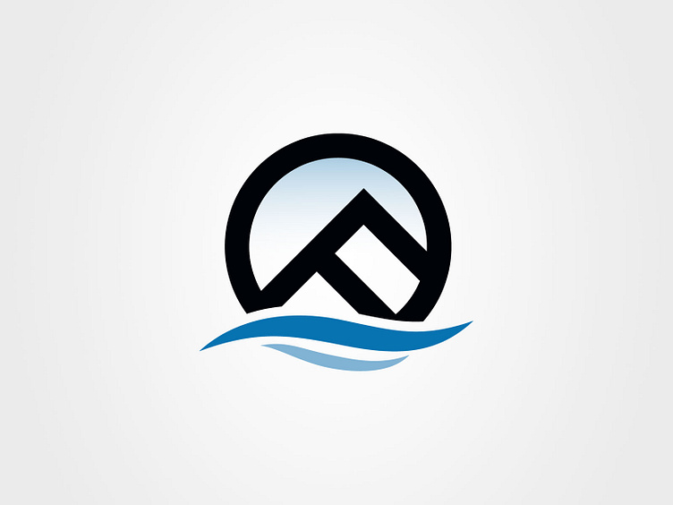
While the designer of the original logo is unknown, my best guess was that the old logo focused largely on the structure of the buildings. I wanted to keep the distinctive pyramid shape that is very prominent throughout the property. But I also wanted to take advantage of the history of the resort by making it feel like an old Montana cattle brand. The lazy F also carries the implication of mountains which is an obvious Montana icon. The addition of the blue waves and the blue sky reinforce the hot spring experience, and the gradient of white to blue in the sky implies steam. Quite a bit of meaning from one logo mark, but this is what I love to do.
