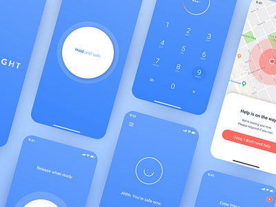
New look, who dis?
You’re looking at Noonlight’s brand new experience (live on Android, iOS coming soon 🎉!)
Hundreds of hours went into designing and building these six screens, but today I want to talk about qualitative research. When a redesign tackles more than just an updated color palette and will greatly impact both routine, longtime users as well as new, impressionable users, any number of changes can give you designer anxiety. Layer on the fact that it’s used during real-life emergencies, and that anxiety is multiplied 💯
What if it puts people in more danger? What if they don’t get it? What if it causes false alarms? What if they stop using it?
I needed to know how people's eyes and fingers moved around the screen, and more importantly, how it made them feel. So, we built an InVision prototype and took to the streets of Santa Monica to prompt pedestrians to try it out.
We were relieved to find that the overall look and feel was received with ease, putting a smile on users’ faces. But, per usual with qualitative feedback, we also stumbled upon a few surprises. More to share about those in the coming posts...
Now that the redesign is live on Android, the real work begins. We’ll collect more qualitative and quantitative feedback from our users. We’ll watch how their behaviors change. We’ll pay especially close attention to reviews and incoming chats. And we'll optimize the hell out of the experience. Stay tuned 😉
