Northern Landings Logo Design
When distillers Northern Landings approached me, they knew they wanted to produce high-end gin in Canada, but they needed a brand identity - a story and personality that communicated the warmth of Canadian hospitality and the ruggedness of the great outdoors.
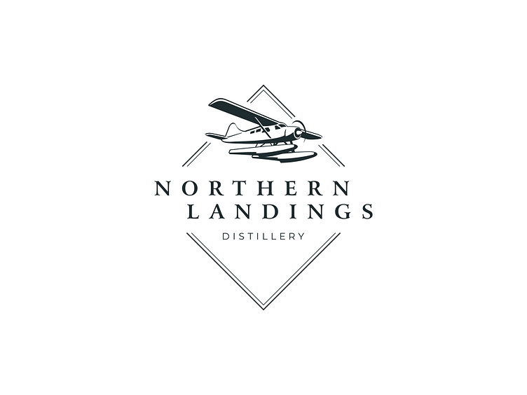
I was inspired by the numerous amphibious floatplanes I saw in and around Lake Muskoka. The idea of coming home from a great adventure mirrored the Northern Landings story - the founders had gone off on their overseas experience, and were returning back home to Canada to start a new journey.
It had a warmth to it that felt evocative and genuine - and the floatplane imagery embodied the story of coming home.
