Windows Explorer Minimal Concept

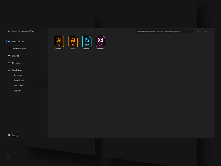


So on a daily basis I spend as much time on Windows 10 as I do on a MacOS but I just can't completely accept either system's dark theme as it is.
In my opinion Microsoft has a leg up leveraging their Fluent design language. However as of right now, both systems have a rather busy UI, especially Windows in an Explorer window.
This is obviously just having fun with the topic, and it could use some further treatment for usability.
What do you think of this concept?