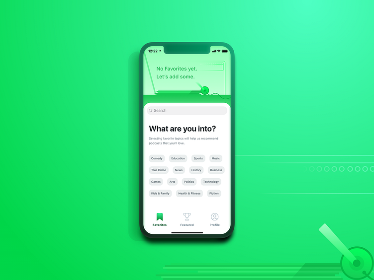
Podcast iOS App - Favorites (Empty State)
I wanted to provide an empty state that helps users more than just providing an illustration and vague message. I achieved this by going directly into the podcast categories section, so that users can discover podcasts more easily.
Empty State Illustration
I created a fun illustration style that informs the users that this section will contain content in the future, but presently directs their attention downwards. With phone’s ever-increasing screen sizes, this top section of the screen is less touchable, so having the illustration placed here works well, as no interaction with the element is required.
Listening Preferences
Anchored by a simple question (“What are you into?”), I chose to give the users a grouping of podcast categories with which to begin their podcast browsing experience.
Both Apple Podcasts and Spotify fail in this regard, in my opinion, by not informing users of these genre possibilities at first. Spotify has a standard empty state illustration/message, but then users have to click “Go To Browse” before they’re able to see categories - an unnecessary step. Apple surfaces popular podcasts here, but categories are hidden in the iOS app until the user scrolls several full-screen views down.
Surfacing these categories, especially for new/early users, makes them obvious and interactive - which ideally results in better engagement and an improved user experience.
Search Bar
I like to utilize default iOS components wherever possible, both to alleviate additional development work, as well as present familiar design elements to users. By placing the Search Bar below the empty state illustration, I give users the chance to openly search (either by general category or specific podcast name), before looking at the podcast categories presented below the Search Bar.
Tab Bar
I find that a tab bar layout is often best when presenting users with a number of different screens. Broken into three sections, I elected to show a filled icon state for the selected tab (“Favorites”) and utilize single-word page names (as opposed to “My Podcasts”). This better differentiates the tabs to avoid confusion by the user and also allows us to expand the feature set in the future by adding tabs.
