Gmail Desktop Redesign
This design was created from the prompt from Briefbox.me (https://briefbox.me/briefs/re-design-gmail-ui-layout/)
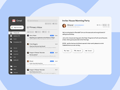
The current design for gmail is very efficient, but also has a lot of information and possibilities for what you can do.
My design is an attempt to address several identified pain points: clarity of language, clarity of action, and clarity of how things are organized.
• Some initial research surfaced that Updates are the most read folder of Google's current inbox categories and forums are the least read, so I removed forums completely and moved Updates up in priority over the social and promotion inboxes.
• I create a different hierarchy into three categories: default inboxes, status inboxes, and self generated folders.
• I restructured and recolored the layout to give a better degree of visual separation between navigation, the list of emails, and the inside of emails while still providing visibility to one's inbox after they open up an email.
• I wanted to give more prominence to "new email" button, so I put the navigation on a dark background so that it would stand out.
• I wanted to give all icons that serve as actions more clarity as to what they are used for, so I gave them labels that are simple to understand and constrained them to a button shape to make them more clear as actions.
• I simplified the language on the "new email" button to try to make it even more clear what the expected outcome of clicking on the button would be for people who might not be as familiar with the word "Compose" or confuse it for other definitions of the word.
• I simplified down the number of visible action buttons to the most commonly used: Mark as Read, Move to..., and delete and buried the rest into an additional dropdown menu.
• I modified the Reply, Reply all, and Forward buttons to mirror the shape and have the same prominence as the "Being new email" button so that they felt more consistent and equal.
• I added labels for emails that have been added to user generated categories and I added a label with the sender's email address for more visibility and clarity.
