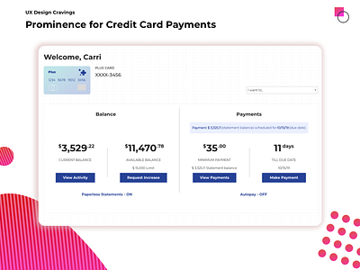
Increased prominence
When looking at our previous solution, it became apparent that changing the color of the payment notification to green would increase its prominence on the page, and provide positive feedback.
For full UX analysis:
https://uxdesigncravings.com/scheduled-payments-a-comparison-of-prominence/
In collaboration with Carri Craver https://dribbble.com/ccgirl
More by UX Design Cravings View profile
Like

