Solar Company Branding and Identity

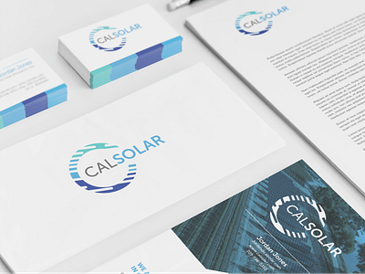
I rebranded a solar company based in California. After some competitive analysis, I noticed everyone was using colors like orange, yellow and green. Nothing stood out. I still wanted something brighter that correlates with the sky, so I chose a lighter blue palette. The logo gives a slight nod to solar and represents the "C" in CalSolar. This project included a website design, SEO, PPC and social media.